

Dancing flames
Among the earliest publications Ka-sing made was a poetry journal called the Fire Blade 火鍔, a primitive hand-stencil-printed tabloid (195mm x 270mm, 8 pages, published monthly in 1969, with 6 issues published). Soon after he would join force with another poetry publication QIU YÍNG SHĪ KĀN《秋螢詩刊》. Based in Hong Kong, this monthly periodical is literally translated as Autumn Firefly Poetry Journal. It was first published in 1970 as a four-page newspaper size stencil print publication, head speared by Kwun Moon Nam 關夢南, a young poet in his mid-twenties with two like-minded friends, Nam Lau 藍流 (容沅林) and Ka-sing 家昇. Ka-sing was about sixteen when he became a part of QIU YÍNG, without foreseeing the fireflies would follow him, weaving more fire nets, igniting and enriching his life then, and even more so now.

The Chinese type-face of of QIU YÍNG 秋螢 was originated from a body of wood-cuts by Ka-sing produced in 1976. It was first used in the Postcard Period (1986-88), and adopted through the final period of the publication.
Hot and Cold
QIU YÍNG, in its various transformations, has lived several lives. I’d taken part in some of the production during the eighties. My impression, and the most remembered and reverent thing in my mind is the logo, the Chinese character of QIU YÍNG 秋螢, drawn from the wood-cuts made by Ka-sing. It has, in fact become an icon of the poetry publication. It has been used as a type face for the journal since it was created in 1979, and continues to represent the publication through 2010. To further arouse curiosity, I would like to offer a little help for those who do not know what the Chinese characters 秋螢 QIU YÍNG (Autumn Firefly) stand for. Let's begin by deciphering the roots in the ideogram and pictogram of the characters.
秋: Autumn (made up of 禾 and 火). 禾: seedings of cereal crops; 火: fire.
螢 Firefly (made up of 火火 and 虫 ). 火火: two fires; 虫: insect.
The dry weather in Autumn would likely draw fires, but fireflies dancing in the cool Autumn night makes an enchanting scene. And youth is, and always will be, burning fire. As the idea of the name gives energy (though meek), it is also vivid and poetic, releasing a hypnotic embodiment of image, music and movement.

QIU YÍNG, the second issue, 1970 (Stencil Period).
275mm x 304mm, 4 pages, stencil printing.

QIU YÍNG the thirteenth issue, 1971 (Letter-press Period).
275mm x 307mm, 4 pages, letter-press printing.
The Five Petal Flower
Intermittently QIU YÍNG had gone through four periods. The initial tabloid format was stencil printed in 120 copies, lasted from 1970 to 71 with 11 issues. It then changed into a bi-monthly, with better quality letter-press printing from 1971 to 1972, producing a total number of 6 issues, each printed in 500 copies.
The next transformation took place in 1978, when Ka-sing and I had just secured a place to establish our photo studio. Though we used our eyes more often now than with words, poetry was always on our minds. Ka-sing suggested to Kwun Moon Nam to restore QIU YÍNG, with new perspective and a fresh concept. For each issue, QIU YÍNG would feature one visual artist along with poems. The tabloid, still retained the size of 11 x 17 inch, would be printed by offset printing on semi-mat paper. The revive issue, which by this time was Number 18, received a lot of compliments. It had also encouraged our friend Tommy Li, who we invited to handle the publication’s design, to experiment more boldly. Starting from Number 20, the publication had grown to the poster size of 20 x 24 inch. This did not happen by chance. The beginning of the eighties was also the heyday of posters, where art, design, commercial and life-style posters were everywhere to meet the consumerist boom. Thus QIU YÍNG adopted this format and we encouraged people to put them on wall. This was wishful thinking, considering that we had neglected the tiny spaces most Hong Kong people were living in. The poster format lasted for a year with seven issues survived.


QIU YÍNG issue 21 (front and back), 1978 (Poster Period).
Designed by Tommy Lee Kam Fai, Photography by Leong Ka Tai.
507mm x 355mm, one page, double sides, offset printing, print-run: 500
There is truth in the Chinese saying: The lotus roots may break, but the threads cling on. Indeed these threads led us back to QIU YÍNG, for a fourth time. When we started off our career, design and photography was very much in demand. Our city, as a commercial magnet of the East, was full of work opportunities. Naturally, income from our work would become the backbone for the resurgence of the publication. And in early 1986, QIU YÍNG Number 25 was born. While Kwun Moon Nam, joined by another editor Yip Fai 葉輝 were responsible for the editorial content, Ka-sing and I took care of the selection of artists, and Tommy Li acted as the design chief. We agreed that the new QIU YÍNG would be designed in an accordion format, linking up eight 4 x 6 inch postcards. Each issue would feature the work of an artist and seven poems. The cover postcard would serve as the editorial page, while the remaining seven would be: one postcard, one poem. The publication would be printed in colours (most times a mix of spot colours), perforated, so each ‘page’ could be torn out and sent flying as a postcard. As a matter of fact, not too many readers wanted to use it as individual postcards, instead they wanted to keep the publication as a complete set, fully intact. There were also those who did not mind to get two copies and set free a few poems. Henceforth we had liberated poetry in its usual form, and incorporated it into our daily lives.


QIU YÍNG Issue 28 (front and back), 1986 (Postcard Period).
Special issue on the poetry of Leung Ping-Kwan with visual works by seven artists.
Publication format: 34x6 inches, accordion folded into 8 pages of 4”x6” postcard.

QIU YÍNG Issue 29, 1986. (Postcard Period).
Photography by Michael Chen
Poets in this issue: 關夢南,廖希,羅寄一,胡燕青,羅貴祥,古蒼梧,淮遠

QIU YÍNG Issue 31, 1986. (Postcard Period)
Wood-cut prints by Chinese artist Gu Yuan
Poets in this issue: 周禮賢,黃燦然,俞風,辛笛,蔡炎培,石斟蘭,葉輝
This Postcard Period (13 issues, from 25 to 37, 1986-88) continued for two years. In reexamining these issues, it appears clear to us in hindsight, that the publication had unintentionally chronicled that period of art and its concurrent activities. Pivotal art exhibitions such as Out of Context 外圍, Journey 游詩, and works by distinguished artists like Antonio Mak 麥顯揚 (1951-94), Yank Wong 黄仁逵 and Choy Yan Chi 蔡仞姿. It is not an overstatement to say that most of the poets and artists featured in the QIU YÍNG Postcard period are now major cultural figures, occupying an integral part of Hong Kong history. Though the publication ceased production in 1988, the experience of this Postcard Period was far-reaching, it lay down root and strengthened the idea for another publication: Dislocation NNHD (92-99), which in the nineties, influenced and triggered off the practice of contemporary photography in Hong Kong.

Promotion and Subscription card for the Postcard Period QIU YÍNG, 1986.
202mm x102mm, offset printing.
On verso of the card printed an introduction to the new format, on which Ka-sing wrote, "Let those who don't read poems read, who don't look at art look, and those who don't do either, do both."

Promotion poster for the launching (Postcard Period), 1986.
Hand-made, photographic paper 16x20 inches (damaged).

Exhibition Catalogue for Poetry and Perception QIU YÍNG SHI KAN 86
An exhibition presented by the Hong Kong Institute for Promotion of Chinese Cultural for QIU YÍNG SHI KAN, featuring a selection of poems and artworks from the first ten issues of the Postcard Period.

In 2003, the launch of QIU YÍNG Resurrection (秋螢復活刊) began with this matchbox, which was designed by the new committee for the publicity purpose, with the idea of passing down the torch.
After the discontinuance of publication in 1988, QIU YÍNG came back after an absence of fifteen years. The fifth attempt, also known as QIU YÍNG Resurrection Period (秋螢復活刊) had the longest life span. It lasted seven years, from 2003 to 2010, and a total of 84 issues were published. The year when the magazine was relaunched we were already living in Toronto, as new immigrants busily meeting our challenges and readjusting our lives. We were also not advised of the relaunch and missed the chance to get involved. This regenerated periodical was principally managed by Kwun Moon Nam, with five other committee members, including Yip Fai. It was designed as a book format, 8.25 x 5.75 inch, published as a monthly with 56 inside pages. The editorial shifted to focus on heavier literary contents, featuring more poems in each issue, design and artwork would just take a minor, and subordinate role. The renewed QIU YÍNG had shed its flashy appearance, to be replaced by a modest and practical demeanor.
A Road that forks in two
Kwun Moon Nam is eight years Ka-sing’s senior. They both love poetry and literature, but poetry is not the only thing that fortifies their friendship, the sharing of indelible memories of living in GuangZhou in their childhood, between the 50’s and 60’s has created a much deeper bond. GuangZhou, the most populous city of Southern China, is merely a two-hour train ride from Hong Kong, but this 130 kilometres distance had created two totally different habitats, one monotonously grey and orderly, the other, somewhat chaotic but colourful. Before the mid-nineties, anyone who rode the train across the two borders would not fail to notice the shift of mood and colour, which extended to even the smell in the air. The departure of QIU YÍNG from a genuine, well-crafted appearance to a demure, down-to-earth look showed different ideas and choices; the former focused on elevating art and creativity, the circle of influence never went too far beyond the elites and the well-educated group, the latter claimed poetry belonged to the masses, viewing it especially an important tool to educate a new generation of young writers, and the more it expanded its outreach, the more influential the publication would be. Kwun and his peers worked hard towards their conviction, their tireless commitment had produced a staggering 84 issues of QIU YÍNG in seven years. This achievement had surpassed many expectations, yet not without regret, as it was a poetry magazine designed and produced mostly to meet local demands and standard, it did not have the capability nor resource, and more importantly, the sophistication to raise Hong Kong poetry to a level on par with the world. It became just another poetry journal among the few that were published around that same time.
In retrospect, a third option had always existed. If the journal, without over-stretching on layout, art and design, could put more emphasis on the balancing act, to respect and pay more attention to the written words, it would’ve become a more proficient and professional publication. In 2011, a new bi-monthly publication Sound & Rhyme 聲韻詩刊 (later renamed Voice & Verse) emerged. It gathered strengths from Hong Kong, Taiwan and Inland China, and after churning out two years of publication, it obtained funding from the government. Economically stable and still in production, Voice & Verse has done it, attaining a level of accomplishment what both Kwan and Ka-sing was unable to fully achieve in QIU YÍNG. Shortcomings of young age, inexperience and overconfidence had taken its toll on us, and only in reassessing the pros and cons of each production period do we come to recognize that blind spot.
Another ten years have passed since the cessation of QIU YÍNG in 2010, we still speak fondly of and reminisce about the publication. But when talking about it, people seem to recollect QIU YÍNG hazily as poems with wings, words perching on the postcards. This deep and enduring impression, with the power of image preceding the power of words, is unfortunately, proved to be too relevant today.

QIU YÍNG issue 25, 1986 (front cover)
Photography by Holly Lee. Editorial on inside cover by 關夢南
Poets in this issue: 羅貴祥,顧城,何福仁,禾迪,康夫,李國威,馬若
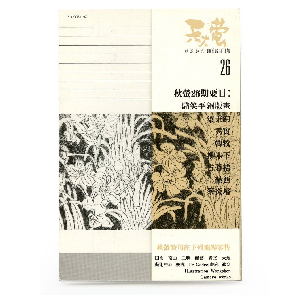
QIU YÍNG issue 26, 1986 (front cover)
Etchings by Donna Lok. Editorial on inside cover by 李家昇
Poets in this issue: 梁秉鈞,秀實,韓牧,柳木下,古蒼梧,納西,蔡炎培

QIU YÍNG issue 27, 1986 (front cover)
Drawings by Yank Wong. Editorial on inside cover by 葉輝
Poets in this issue: 辛笛,迅清,飲江,顧工,陳德錦,銅土,秦天南
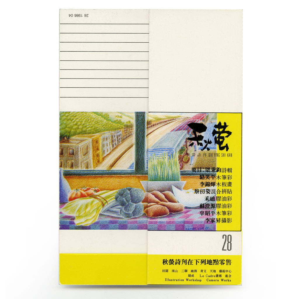
QIU YÍNG issue 28, 1986. (front cover)
A special issue on the poems by Leung Ping-Kwan 梁秉鈞.
Cover art by Donna Lok. Inside art: Tommy Li, Choy Yan-Chi, Lok Yin-Ping, Joe So, Ku Chiu-Ping, Lee Ka-sing.
Editorial on inside cover by Leung Ping-Kwan 梁秉鈞

QIU YÍNG issue 29, 1986 (front cover)
Photography by Michael Chen. Editorial on inside cover by 李家昇
Poets in this issue: 關夢南,廖希,羅寄一,胡燕青,羅貴祥,古蒼梧,淮遠

QIU YÍNG issue 30, 1986 (front cover)
Sculptures by Antonio Mak. Editorial on inside cover by 戴天
Poets in this issue: 鍾國強,鍾玲,何福仁,蔡其矯,韓牧,黃襄,顧工
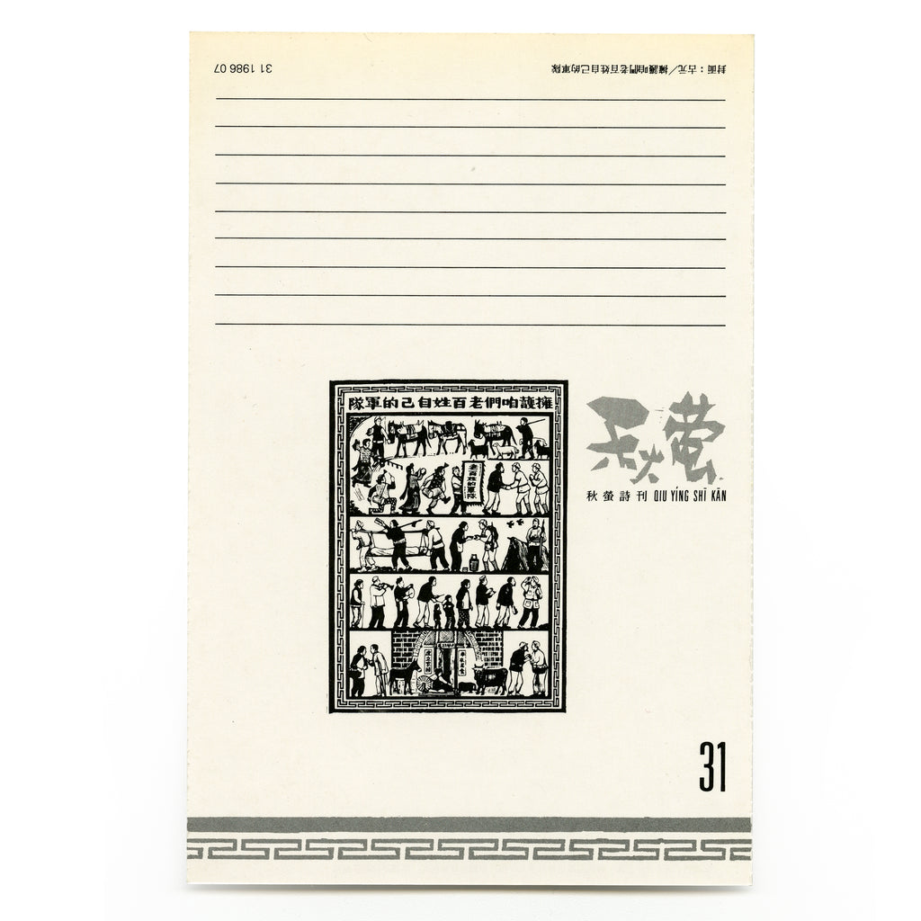
QIU YÍNG issue 31, 1986 (front cover)
Wood-cut prints by Gu Yuan 古元. Editorial on inside cover by 王仁芸
Poets in this issue: 周禮賢,黃燦然,俞風,辛笛,蔡炎培,石斟蘭,葉輝

QIU YÍNG issue 32, 1986 (front cover)
Special issue on woman poets, organized by Donna Lok 駱笑平
Etching by Donna Lok. Editorial on inside cover by Donna Lok
Poets in this issue: 禾迪,吳煦斌,適然,石斟蘭,郭坤敏,銅土,舒婷

QIU YÍNG issue 33, 1986 (front cover)
Documentation of an installation of Choy Yan-Chi, photography by Holly Lee.
Editorial on inside cover by 羅貴祥
Poets in this issue: 關夢南,葉維廉,王寅,葉輝,梁秉鈞

QIU YÍNG issue 34, 1986 (front cover)
Photography by Alfred Ko. Editorial on inside cover by 葉輝
Poets in this issue: 何福仁,葉維廉,胡燕青,飲江,馬若,黃燦然,羅貴祥
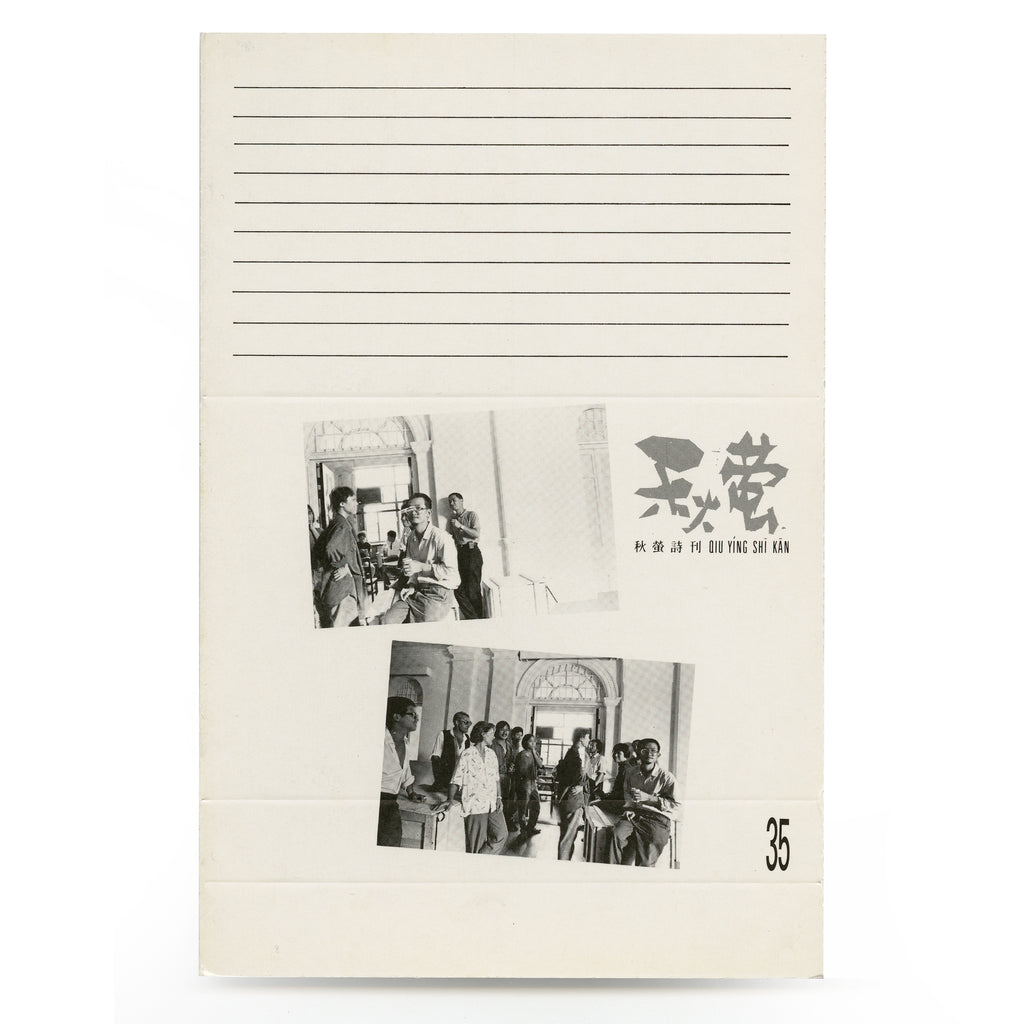
QIU YÍNG issue 35, 1988 (front cover)
Out of Context exhibition, photography by Holly Lee
Editorial on inside cover by 黃繼持
Poets in this issue: 納西,葉輝,梁秉鈞,歐陽江河,葉辭,鄧阿藍,李英杰

QIU YÍNG issue 36, 1988 (front cover)
Drawings by Lau Chun. Editorial on inside cover by 張超羣
Poets in this issue: 柏樺,胡燕青,關夢南,飲江,韓牧,黃燦然,馮晏

QIU YÍNG issue 37, 1988 (front cover)
Photography by Lau Ching-Ping. Editorial on inside cover by Lau Ching-Ping 劉清平
Poets in this issue: 毛文羽,羅貴祥,王良和,秀實,孫文波,陸憶敏,康夫