
It probably began in early 1975…
Ka-sing used to be known by Wingo to his friends, a name he made up, a name that made me think of flying freely like a kite in blue expansive sky, a name of sheer imagination. The first name card (so I think) he made was actually the address where he lived, lying north of the island of Hong Kong. It was an old pre-war four-storey building. One day, while sitting on a double-decker tram passing by on busy King's road, I saw him perching on the balcony reading a book, in his apple-green long sleeve shirt, rolled up half way.

Single side, 89mm x 53mm, circa 1974-75.
The first name card.
The word game
In the years pursuing we lived together, writing, photographing and chasing puppet shows and performing artists in the after-hours of our day jobs. Shortly after, I quit my bank job, used up my pension to rent a 500 square feet studio in a small back street called Lan Kwai Fong in the central part of Hong Kong. While working diligently as self-trained fledgling photographers, we were still in touch with our literally friends, and at the back of this name card I found in the Rolodex, the telephone number I wrote down of ah Nam, a blue collar and self-taught poet. He was to become one of the most celebrated poets in Hong Kong. In 1979, we moved up to nearby Wyndham street, where we used the name Holly & Wingo Lee Studio. Name card index albums and boxes were used extensively during those years, and two more name cards demonstrated this. In this yellow name card is my writing of the residential and work number of Leung Kui-Ting, who was an artist, as well as my teacher at the evening design school I attended in 1972. On the other card featuring Wingo working, Danny Yung wrote down his phone number and address for us. Danny is a founding member and co-artistic director of Zuni Icosahedron 進念, an esteemed Hong Kong-based avant-garde theatre founded in 1982. Thirty-some years after, we met Danny again in Toronto, when he came to open his exhibition “Blank Boy Canvas” at the Gladstone Hotel in 2015.
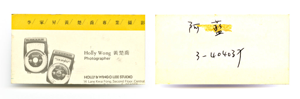
Double side, 85mm x 45mm, trimmed, circa 1978.
Name card used in Lan Kwai Fong. The poet Ah Nam's name and phone number was hand-written on the back by Holly.

Double side (back side with plain light yellow), 92mm x 51mm, circa 1979.
Holly's hand writing of Leung Kui-Ting's residence and work number on the back of the card.

Double side, 89mm x 52mm, corner trimmed, circa 1980.
On both sides, photographs showing Ka-sing working in studio. (left) Danny Yung's hand writing of his phone number and address.
As I was always wondering how the name Zuni Icosahedron 進念二十面體 for this experimental theatre originated, people must have also wonder where did the name of the Hong Kong photography magazine NuNeHeDuo 女那禾多 (1992-1999, also known as Dislocation) come from. “Zuni”, if we googled, is a colour between blue and green, the colour value is #008996. Icosahedron is a twenty-sided object. Together it projects two essential visual elements: colour and form, invoking bodily movements in theatre works. For Dislocation Magazine - a contemporary photography journal, we wanted to express shifting, and delicate movements 移, like silver halide crystals dancing on film when exposed to light, like the way a beautiful woman elegantly passing by 娜. In Chinese we chose to use 娜移 nuó yí for such an impression. And furthermore, as an experiment, and for fun we split the two Chinese characters 娜移 into four individual characters that became 女那禾多 Nu Na Hé Duo, which is phonetically Mandarin, and when translated word by word into English they are: woman, that, grain, abundance. It was the related yet unrelated elements we found fascinating, images interplayed with words, and words conjuring up images. In the same manner, if I wanted to be naughty today, I would describe and translate into Chinese Zuni Icosahedron’s theatre as a collaborated dance: 騷離 愛共耍輕進. Zuni, love, together, play, lightly, forward. The Chinese characters suggest such playful imageries, like a 'push push' in aerobic dance. And by the way, just as it's not confusing enough, when we read the name out aloud, to be in line with the English sound, it should be read in CANTONESE, the more ancient and popular dialect in Southern China.

Single side, 85mm x 50mm, circa 1996.
NuNaHéDuo name card - Holly Lee.

Single side, 85mm x 50mm, circa 1996.
NuNaHéDuo name card - Ka-sing Lee.
Up and down Castle Road
In 1982, our studio was relocated further uphill, to 35 Castle Road. It was not ideal and we had to move again either at the end of the year or in early 1983. Despite the negative impact it was the place where I conceived my daughter, and began motherhood months later. During that period we became acquainted with the Illustration Workshop (the most cutting-edge design team at that time), and had collaborated with them for some commercial work. While working in this studio I had a beautiful name card designed by Philip Kwok (1955-2009 郭立熹), a prominent member of the Illustration Workshop. He borrowed the idea from the Polaroid SX-70 camera, and asked that the name card to be printed in the exact squarish format of the Polaroid instant film. The image was bold red and yellow with hints of black and blue, a showy, flashy name card that I still love very much today. I only used it for a short time because we were moving again.
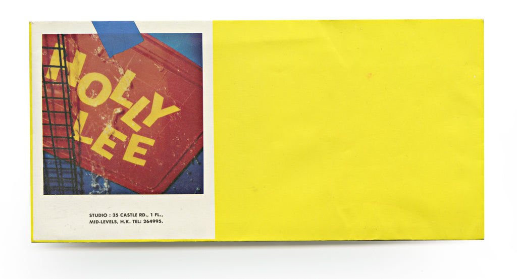
Envelope, 222mm x 108mm, circa 1982.
Designed by Philip Kwok of the Illustration Workshop. The complete set of design also included the letter sheet printed in full colour.

Single side, 90mm x 108mm, circa 1982. (right) Polaroid SX-70 original, 90mmx108mm, photographed by Philip Kwok.
Philip's design of using the Polaroid SX-70 camera as Holly's name card was based on her practice as a photographer. Since the card was the exact same size of an SX-70 film, the name card could possibly be ejected out from an SX-70 instant camera. We had tried. It worked out perfectly!

Single side, 92mm x 65mm, circa 1982.
Ka-sing designed this for himself, as an extension to the Polaroid concept. He photographed a section of the Polaroid 4x5 film holder. Since he started his career as a professional photographer, he had used 4x5 view camera for most of his assignments, but the format at one point had climbed up to 8x10 inch.
Downhill, at the foot of Castle Road number 3, we changed the company name to Camera Works holly & wingo. The new stationery design was by another Illustration Workshop member, who was also a good friend of ours - Tommy Li (1954-2016 李錦煇). Wingo suggested to put a poem in our moving notice and went on to select a poem by Xi Xi (西西). It seemed, as he recalls now, a subconscious statement then to the working attitude and direction we were heading to. In a way, Tommy also revealed his influence, his east vs. west consciousness by using more Chinese in his design, say setting the English alphabets vertically, from top to bottom (like writing in traditional Chinese way). However, some could argue in real traditional Chinese writing direction, a column should start from right to left. In this case, our address was read from left to right. but we didn’t mind. The design of our name cards at this stage was so neutral, so ‘shared’ that there was only the company name in the front, and at the back, we each signed our names to identify.

Double side, 90mm x 55mm, circa 1983.
This name card was designed by Tommy Li. Ka-sing knew Tommy since the beginning of the 70s. They were really best friends. On verso, Ka-sing's signature, as an element for the design.

Double side, 90mm x 55mm, circa 1983.
Holly Lee's signature.

Moving notice on letter sheet, 208mm x 296mm, circa 1983.
A moving notice letter sent to clients and friends. Studio letter sheet with Xi Xi's poem Can We say on the right.

Publication, 203mm x 153mm, Published by ZEPHYR Press, 2016.
not written words, a collection of poems by Xi Xi, translated from Chinese by Jennifer Feeley. The poem Can We say was used in our studio letter sheet.

Double side, 95mm x 56mm, circa 1986. Designed by Tommy Li Kam Fai.
The image was a swimming pool backdrop. It was used for an ad for Palmolive Soap. Here's the story, an ad agency shot the commercial film for Palmolive Soap at a Los Angeles swimming pool, and after shooting, they needed a still photo for print advertising, which they forgot to take. It was too late, they were already back in Hong Kong. The agency approached us for a solution. Our task was to recreate the scene and shoot the same shot with a model. This was the set before shooting.

Double side, 95mm x 56mm, circa 1986. Designed by Tommy Li Kam Fai.
The image was taken from an editorial assignment for the Hong Kong Trade Development Council. Ka-sing always got his freehand in handling assignments.
Towards the end of the 80’s we attempted to set up another base in New York. It was precisely at that time Wingo was reignited by his eastern identity, and decided to use only Ka-sing, his Chinese name. I love my English name given by my uncle and I wanted to keep it. So the company had become Cameraworks, Ka-sing & Holly. Oh, by the way, a little note on the name ‘Camera Work’, a name we had associated with from the 80s to 90s. We both admired and got inspired by the photographic journal Alfred Stieglitz published from 1903 to 1917 known as Camera Work, a simple but direct name telling eloquently its very nature.

Double side, 89mm x 53mm, circa 1989-90.
At this stage, we had two addresses in the name cards, one in Hong Kong and one in New York. The image in this card was a portion from the photograph Hong Kong Ni Hao. This was an editorial photograph taken in 1988 for the Mandarin Oriental Magazine.

Double side, 89mm x 53mm, circa 1989-90.
The image in this name card was from Holly's 89 • The Golden Lotus • Footsteps of June series.
Last Stop
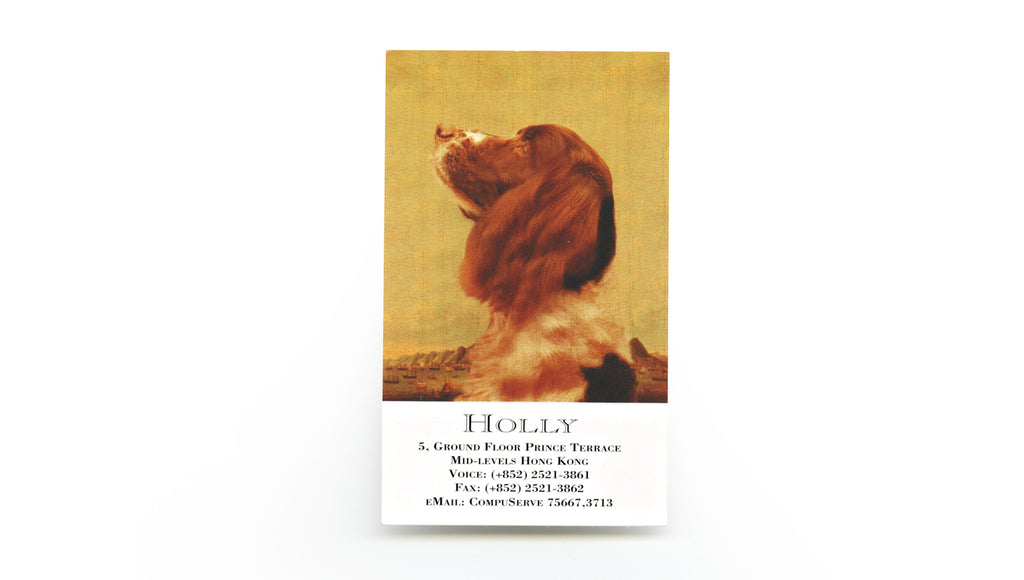
By the time we moved again, around the beginning of 1991, our name had a slight change, to Ka-sing, Holly & Cameraworks. The studio moved to a much smaller space at Prince Terrace, just 3 minutes walk from our old place. It would be our last anchor in Hong Kong. The next, which would be in 1997, and our final move in the city, would be across the oceans, over 7800 miles, to Kanata.
Rewinding back to Hong Kong in 1991, through a mortgage we bought a ground floor flat of a four-storey building at number 5, Prince Terrace. It was the first time we owned a permanent studio, though it was a bit small. In this small studio we had a very productive period. In some miraculous ways, we’d done some commercial assignments that could have required a much larger workplace. Also at that time I was contacted by the US photo agency Black Star to shoot corporate portraits in Asia, so we had to put two contacts in our name cards, one in Hong Kong and one in the US. Upon closer look I am also reminded of another interesting fact of the past - that was when we first started to use electronic mails. They were slow, and not yet popular. In fact, today we’d take it as a joke about the snail-crawling speed of the computer. Using Photoshop in those early days was a pain in the neck, after each click and command for a task came a long wait, and you had to kill time by resuming the novel you didn’t finish the night before.

Double side, 95mm x 51mm, circa 1992.
An image created for the cover of Lau Kin-Wai's book published in 1992, on art criticism.

Double side and centre-fold, (upper) image, (lower) inside, 176mm x 44mm, circa 1992.

Double side, 86mm x 112mm, circa 1992.
For this name card, the design used Holly's transferred images from her photographs of a doll and a mannequin, which were originally taken for editorial purpose. By the time we left Hong Kong we gave the mannequin to Almond Chu, another photographer friend of ours.

Single side, 88mm x 54mm, circa 1991-2.

Single side, 89mm x 53mm, circa 1991-2.
Our design began to use two symbols signalling two identities. "Star" for Ka-sing because the character 昇 in his Chinese name is arise, and the star 星 has exactly the same sound. For that reason, 'star' appeared in a lot of his photographs. A signature, in his own word. The globe and circle were, Holly's.

Single side, 90mm x 44mm, circa 1991-2.
The word photo-illustration was used frequently in those days. It described the kind of photography (usual incorporated some graphic elements), distinguishing it from street, table-top or product photography.

Single side, 90mm x 44mm, circa 1991-2.

Double side, 89mm x 57mm, circa 1993.
This image was for a Christmas card, a combination of a photogram (by Holly) and linework elements from Ka-sing's photo-illustration. Those linework collages, he named it collectively as : The Thinbit studio series".
Single side, 89mm x 53mm, circa 1994-5.
Holly did this portrait of Jinx originally for her client/friend Lilian Tang for a Christmas card. By circumstance and fate it lit up the whole series of Hollian Thesaurus she produced from 1994 to 2000.

Single side, 89mm x 54mm, circa 1995.
One from a suite of four images for the OP Editions catalogue in 1995. The X (cross) is one of Ka-sing's favourite elements.
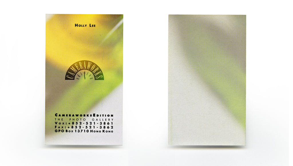
In this street level studio, the terrace stretched about thirty feet across, to the opposite street facing another row of buildings with different heights. Due to the inaccessibility of any commutable street, car traffic was non-existing. That meant we could enjoy the extra open space outside our studio. That was also the reason why we loved this place, quiet and quite peaceful. Simultaneously this was the place where we produced the first contemporary photography magazine of Hong Kong - NuNaHeDuo (Dislocation 1992-1999), and developed the concept of marketing Hong Kong photography through the setting up of The Original Photograph Club (1994-1999), released limited editions from The OP Print Program as OP editions. But before the OP editions, we used the initial name Cameraworks edition, with a logo designed by David Lui. We met David in New York, and after working there for a while he returned to Hong Kong to continue his career. The name Cameraworks edition was used for a very short period before replaced by OP editions.

Single side, 88mm x 53mm, circa 1995.
A rare card printed but never used. McCulloch left Hong Kong for family matter, the artist project didn't happen. But we started to represent some of the Hong Kong artists.

Double side, 85mm x51mm, circa 1994.
CameraworksEdition was used for a very brief period. In 1995 we began the identity of OP.
Double side, 85mm x51mm, circa 1994.
Single side, 88mm x 54mm, circa 1996.
The images applied to this series of OP name cards were photograms made by Holly. A suite of four photograms were used for the covers of the quarterly OP Editions catalogues.

Single side, 88mm x 54mm, circa 1996.
DIGI (1994-1996) was also another magazine we launched during the period. The editorial content was purely imageries created by computer. As I was writing this piece Ka-sing mentioned something quite interesting. He said his use of the ultra wide-angle 20mm lens in the early days was largely influenced by the Polish-born American photographer Ryszard Horowitz, and that was in the 70s. By the time we created DIGI, Ryszard Horowitz was well known and recognized for his surreal visual compositions and skill for digital imaging. So when he was invited by the Hong Hong Institute of Professional Photographers to come to Hong Kong as a judge, we grasped the chance to interview him, and published the content in the second issue of DIGI. In contrast to Dislocation, the editorial content in DIGI was more global, and gave us many opportunities to collaborate with overseas artists.

Single side, 88mm x 50mm, circa 1995.
DIGI was published from 1994 to 1996.
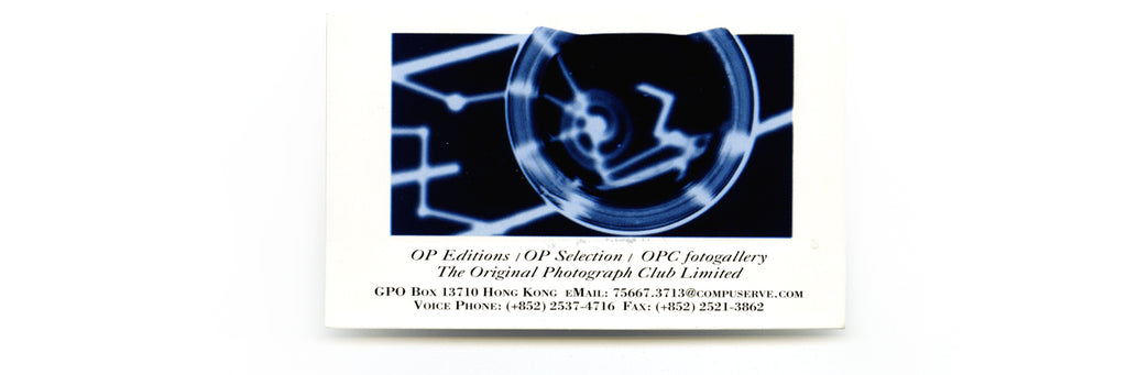
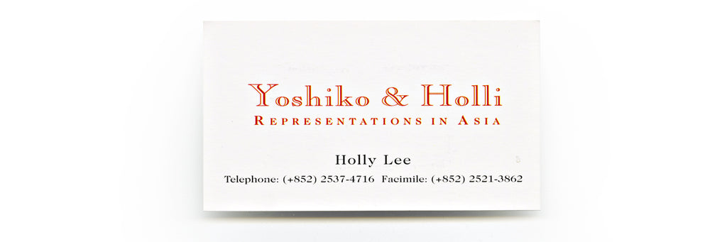
In the meanwhile I started a venture with Yoshiko, a Japanese writer and musical event organizer based in Hong Kong, to promote and represent visual artists in Asia. It didn’t work out as we did not have a focus, and we each had already too much on our plates. By the second half of the 90s, the OP Club, which ran the OP Print Program had considerable success in creating a photo market in Hong Kong, and a year after we left the city, in January 1998 we felt confidently to open the first photography gallery in Hong Kong - The OP fotogallery. In April the same year NCP, NuNaHeDuo Centre of Photography was established with partial fund from the Hong Kong Art Development Council. For over three years, until 2001, it shared premises with NuNaHeDuo (Dislocation magazine), OP Club, and OP fotogallery. Ka-sing presented the last exhibition with work by Araki before we closed the gallery door in the latter part of 2001. He told me that Kith Tsang, a Hong Kong established artist had kept the stone, which safe-guarded our door for many years, as a souvenir out of sentimental reason. Did those years really vanish without a sigh?
Single side, 88mm x 50mm, circa 1995.

Single side, 89mm x 54mm, circa 1997.
Who would need an address anymore, thought Ka-sing. He had become a bird in 1997, flying between Hong Kong, Toronto and some other cities.
Years after the flood (from September 1997-)
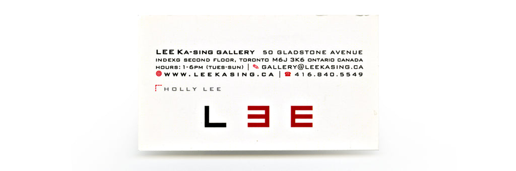
When we first arrived in Ontario we lived in Markham, a 35 minutes drive from downtown Toronto. I had my first name card printed with the Avery business cards templates. Obviously they were not much of use as it did’t even bother me that I’d forgotten to put the phone number and email address on it. I was still coordinating work of the magazine, the Club and the exhibition. After we moved down to the first floor of Candy Factory Loft on Queen Street West and started our operation there in 2000, we named our Toronto gallery as OP fotogallery for half a year, working in sync with the Hong Kong gallery. But, our conception, and our New York impression of a gallery inside a loft did not work out. First, the loft management did not allow us to put any signboard on the pavement in front of the building, or around, not even a sign on our flat window to indicate that there's a gallery. To buzz entry into the building was also a discouragement to Torontonians, who are always overly discreet and easily intimidated. After six months we changed the gallery name to LEE, Ka-Sing Gallery. We went a step further to display a wood alphabet sculpture L E E (hand-made by Ka-sing) on the ledge of our big window, so that people passed by would see it. It became our standard gallery logo. In the beginning, we had no grand plan to establish a big gallery business in Toronto, we just wanted to create a meeting point, where photographers and photo enthusiasts could meet. Nevertheless we worked hard to produce quality exhibitions, adding bit of zing into the photography gallery scene in Toronto.

Single side, 89mm x 51mm, circa 1997.
A personal name card of Holly, in the first year she moved to Toronto.
Single side, 89mm x 51mm, circa 2000.
Before setting up gallery in Toronto, we had already begun to venture online in those early Internet days. We set up our own web and database servers. In 2000, the gallery began working on par with our web-based projects.
 Double side, 91mm x 54mm, circa 2000.
This was one from a series of images, that we featured and promoted our artists on the cards. Yao Jui-chung was one of the noted artists we represented. He was in Toronto for few times back in the days, as our invited artists and mounted his solo exhibitions at our gallery.

Single side, 90mm x 50mm, circa 2001.
Lee Ka-sing gallery at the Candy Factory Loft. With main focus on representing noted artists in Asia. In our stable we carried artists such as Nobuyoshi Araki, Yao Jui-chung, Leung Chi-wo, Narahashi Asako and Yau Leung, as well as Canadian artists such as Diana Thorneycroft, P. Elaine Sharpe and Balint Zsako.
Our circumstance changed drastically in 2006. Despite an unpleasant incident, the failing to go to the already paid for Alternative Art Fair in New York, we committed to something even more far-reaching - to move the gallery further west of Queen Street West, to the corner of Peel and Gladstone, to a hundred-year old three-storey building. We cracked our brains to find an appropriate name, a signature for the newly-accquired place, which we felt rectangular, solid and humongous comparing to what we had before. We arrived to the name IndexG, as G stands for Gladstone, Index, a finger pointing to. It proved to be another fogged name, hard to pronounce and hard to remember - that is if you haven’t been told of the logic. In this building we’ve settled down, run two floors of galleries for two years (2006-2008) and galleries on the ground floor for twelve years (2006-2018), a B&B (2008-) until now. We came to know a lot of good artists that are not in the front line or in the main stream, many of whom are just like us, from elsewhere. The diversity and quality of art is simply amazing. Without much acknowledgement and recognition, no publicity and nobody writes about them. These works just exist in their own circles and die, one day. But what does one expect from the dominant age of social dilemma? If you don’t socialize, even serious writers are putting out of place, and out of work. This era has created many channels and opportunities for many people. But it's an ocean with views running amok, the amount of information is suffocating and drowning. The good, the bad, the ugly, the beautiful are all on board.
Single side, 89mm x 50mm, circa 2006.
LEE KA-SING gallery moved to 48, 50 Gladstone Avenue in 2006. The inaugural exhibition "DOUBLE 6 -SIX OCCURRING DIALOGUE" occupied the two floors of the gallery spaces in our newly owned building. Six pairs of artists: Anothermountainman, Bing Lee, Balint Zsako, Henrik Drescher, Millie Chen, Lisa Cheung, P. Elaine Sharpe, Evergon, Diana Thorneycroft, Frank Rodick, Asako Narahashi and Normand Rajotte.

Single side, 89mm x 51mm, 2017
The galleries at 48, 50 Gladstone Avenue was operated for two years. In 2008, the second floor gallery space was transformed into a Bed and Breakfast venture, while the gallery remained on the ground floor street level.

Single side, 89mm x 51mm, 2017.
In 2015, the ground floor gallery was renamed as GALLERY 50, and mainly used as a rental gallery. Occasionally we'd organize our own projects, switching focus to work more on personal work.
The ocean still pounds
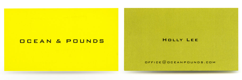
We won’t give up. We’ll still contribute, self-publish and help others to. We’ll share art like birds sharing their songs. There’re handfuls of projects awaiting. As we continue to evolve so do our name cards. With every card, it shows the little twists and turns we’d taken, things we’d already done, left behind and forgotten. I really like Ka-sing’s recent name card (also it is his favourite) with the Chinese name, the three characters Lee Ka-sing 李家昇 in calligraphy by Araki 荒木經惟. It reminded me of Tokyo, the bars Araki frequented and his karaokes. Like his calligraphy Araki really loves to sing and dance. I had the chance to join him one evening in a bar and was forced to sing “Yesterday”, a Beatles song. But the name OP belongs also to today, it only changed its definition after we came to Canada, as nobody understands its meaning and significance, it is out of context. That is also why we gave it new clothes, Ocean & Pounds, in return it gives us sound and image. The other day, a man walked by our driveway and he stopped, pointing to the licence plate of our Honda and asked, “I was always curious, what does OP OP stand for?” And I said to him,”Oh it’s just a sound, like a dog’s bark.” Or the ocean roars, I thought and smiled lightly. I wouldn’t want to tell him the long story, I bury them in our heart beats, swimming in ocean and thrashing against edges of concrete piers, as dissolved memories, bit by bit, washing away. (September 15, 2020)
Double side, 90mm x 50mm, circa 2007.
After closure of the gallery projects in Hong Kong, OP focuses on its base in Toronto. We incorporated and adopted the official name - OCEAN & POUNDS, working projects alongside the gallery venture. The gallery eventually ceased operation in 2018, and we now have time to put our energy on the online shop, and to develop a line of fine Print-on-demand publishing.

Double side, 90mm x 50mm, circa 2007.

Single side, 88mm x 50mm, circa 2015-16.

Single side, 89mm x 51mm, 2017 to current
Back to basic. Ka-sing's personal card which has used for few years. His name in Chinese charaters is the calligraphy by his friend, and also an artist he represented in the gallery days, Nobuyoshi Araki.