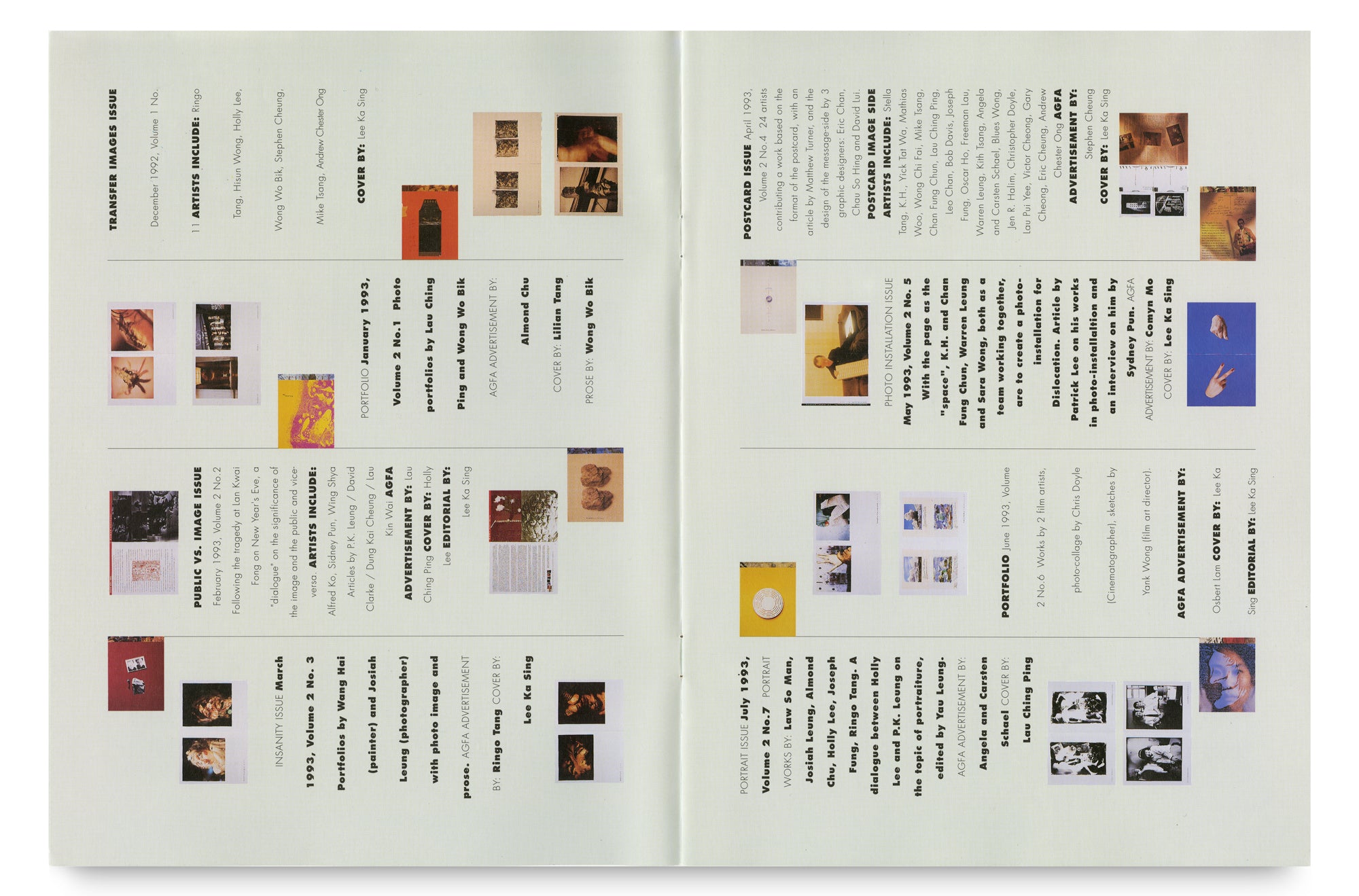
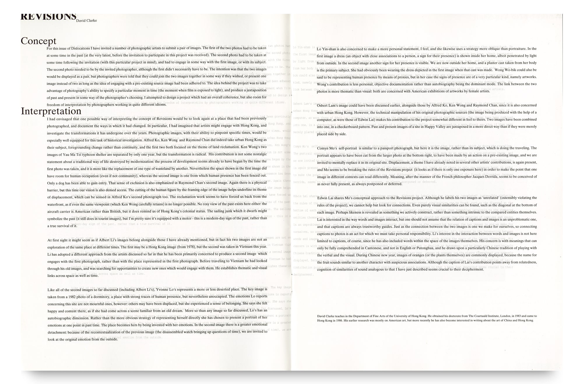
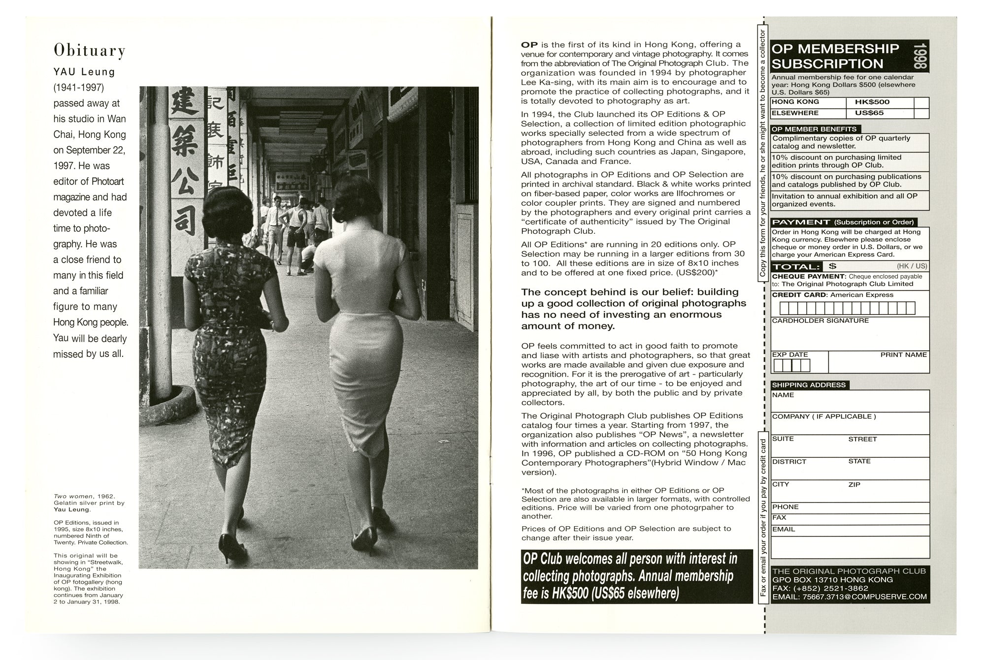
The DIGI name card I used with the magazine's launch in 1994. The logo - a narrow, elliptic, sharp at both ends shape was originally designed by Ka-Sing Lee, further developed by Chiu-Ping Ku in variations with 3-D rendering, which could be seen in the masthead on different issues of DIGI.
From reed pens to digital pens
In the beginning of our photography career, we used an Underwood typewriter given to me by my colleague (when I worked in the bank), and we used it mainly to produce invoices and daily correspondence. My fingers were always smeared with black, thanks to its black and red ribbon, and the cavity in the “a, e and o”s were often smudged and dirty. Later on I moved to a portable blue Olivetti, happy that I could choose any place to work, and equally pleased by the fact that I didn’t have to hit so hard on the keys. It was with excitement and great faith in technology when we spent a fortune to buy us our first Apple computer - Macintosh II in around 1987 or 88, feeling the necessity to hold the future on our own hands.
Macintosh (originally McIntosh) was named by Jef Raskin, an Apple employee in 1979, after his favourite type of apple. Discovered in 1811 by John McIntosh on his Ontario farm, McIntosh is often called the national apple of Canada. Macintosh, the “Mac” was the first personal computer with a graphical user interface and a mouse that proclaimed itself user friendly, and that was the reason we chose it over our previously used PC. Even a child could use it, but of course, it needs more than a computer-illiterate person to use it well. In fact the early days of computer usage was limited and time consuming. Our Macintosh II (supposed to be the highest model at that time) had only 4 mb (megabyte) of RAM, a 20 mb hard disk, which Ka-Sing later upgraded (by himself, opening up the cpu) to its maximum of 20 mb RAM memory capacity, with a third party expansion card to the motherboard. In 1989, we were already creating work using basic digital support, with the earlier Photoshop version 1.0, as well as some pre-photoshop era programs such as PixelPaint (a colour version based on MacPaint) and Studio 32. It was amusing to think back in those day, whenever we processed an image, we had enough time to grab a book or a magazine to read, while waiting for the machine to complete the command we put in, one after the other.
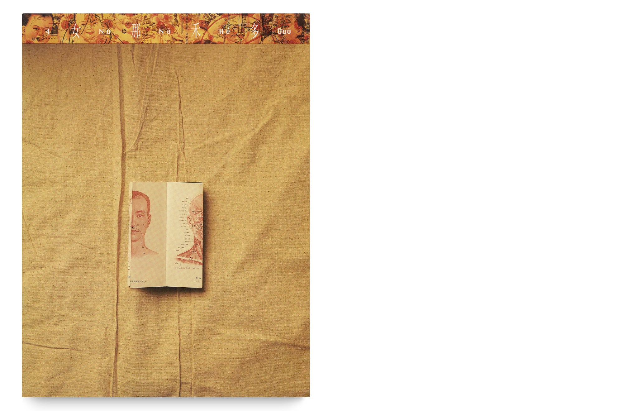
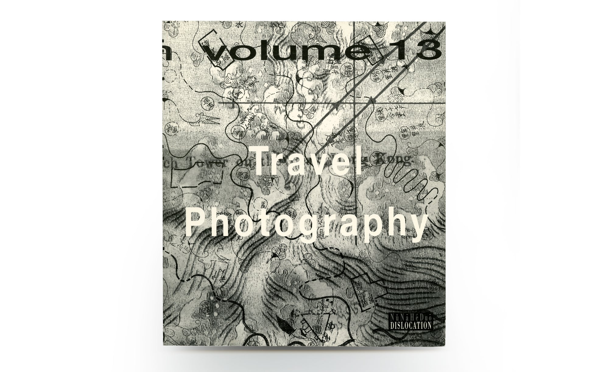
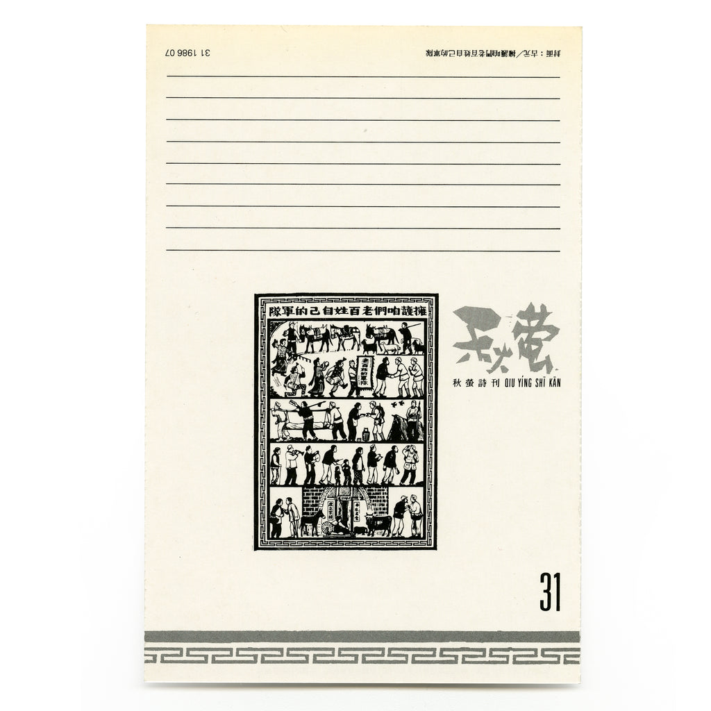
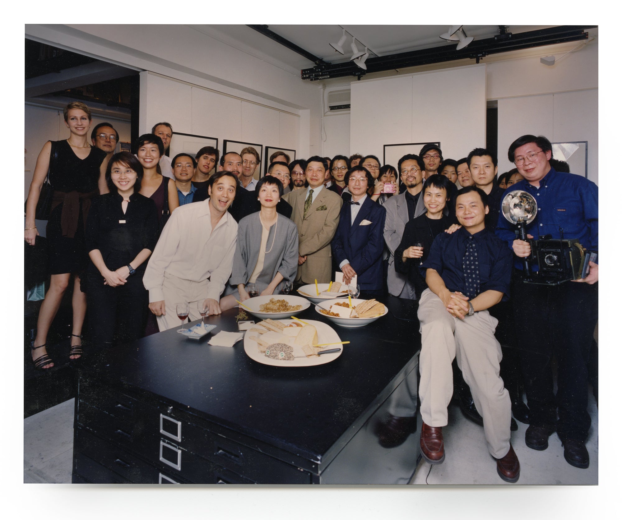
We were using Mac II when we started NuNaHeDuo (DISLOCATION) magazine in 1992. After two years, in 1994, the hot digital culture had motivated us to create another magazine, a visual magazine that would feature work only executed on the digital platform. We called this magazine DIGI 秩智 (short for digital, the Chinese translation of 秩 is order, also a sound pun for DI, whereas 智 means wisdom). Modelling after DISLOCATION, we collaborated with Yau Leung, the editor of PHOTO ART to produce an encapsulated 16-page DIGI in his magazine. I took on the role as editor, with Ka-Sing overlooking layout execution and production, with additional help from David Lui 呂兆偉, a friend and an artist we met in New York. Furumai Yoshiko 溫子, a Japanese active in the Hong Kong artists' circle, especially among popular music bands, acted as our correspondent with Japanese artists, and Blues Wong 黃啟裕, a committee member of DISLOCATION helped us with translation.
The first issue “Talking Head” was published on 25th of January, 1994, featuring ten artists each contributing an image produced with the aid of a computer. By this time our studio had already moved on to another generation of Apple computers: Macintosh Quadra 950 and 800, two top-of-line machines we acquired for commercial work, also functioned as a platform for us to produce DIGI. In the course of two years, we churned out thirteen issues. Whilst featuring vanguard work from international artists inspired by new technology, we also coordinated with writers and artists to shoot forth special issues probing the nature, role and impact of photographs in the dawn of the digital imaging order. The mid-nineties was the infancy stage of electronic imaging, when every artist, famous or little known, was a beginner and a learner. We were, on the one hand, able create a space to showcase digital artists in Hong Kong, and on the other, to collaborate with or featuring the work of some prominent artists at that time, such as Tadanori Yokoo and Hideaki Motoki from Japan, Unique EditionsX, Steve Bliss & Alan Magee from the United States, Daniel Lee from Taiwan now based in New York.
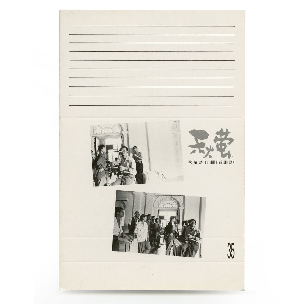
Following the practice of DISLOCATION, each issue of DIGI had an independent copy, and all thirteen issues were case-bounded in two volumes: Volume I (#1 to 6, 1994); Volume II (#1 to 6, 1995-6). After our departure from Hong Kong in 96, and Yau Leung’s death in 97, most copies of DIGI, loose or case bound were dispersed, or perhaps discarded. We have fortunately some copies of Volume I and II, and one full set of loose copies on hand. They might be among the few surviving copies in the world. Flipping back pages of each issue, we still marvel at what we’d done, and could reinstate the fact that, though short-lived; DIGI was a phenomenal magazine, vividly reflecting a time when everything was dashing toward an amorphous cyber future. It is a hidden gem buried, now regained, duly missed yet worth remembering.
DIGI, Vol. 1 #1 (January 25, 1994), 8.5x11 inch, 16 pages.
Talking Head Issue. Artists: Ka-Sing Lee, Chiu-Ping Ku, Tommy K.F. Li, Dean Morris, Holly Lee, Eric Chan, Shuk-Man Ho, Camay Wong, Iris Lee, David Lui. Cover by Ka-sing Lee.


DIGI, Vol. 1 #2 (February 25, 1994), 8.5x11 inch, 16 pages.
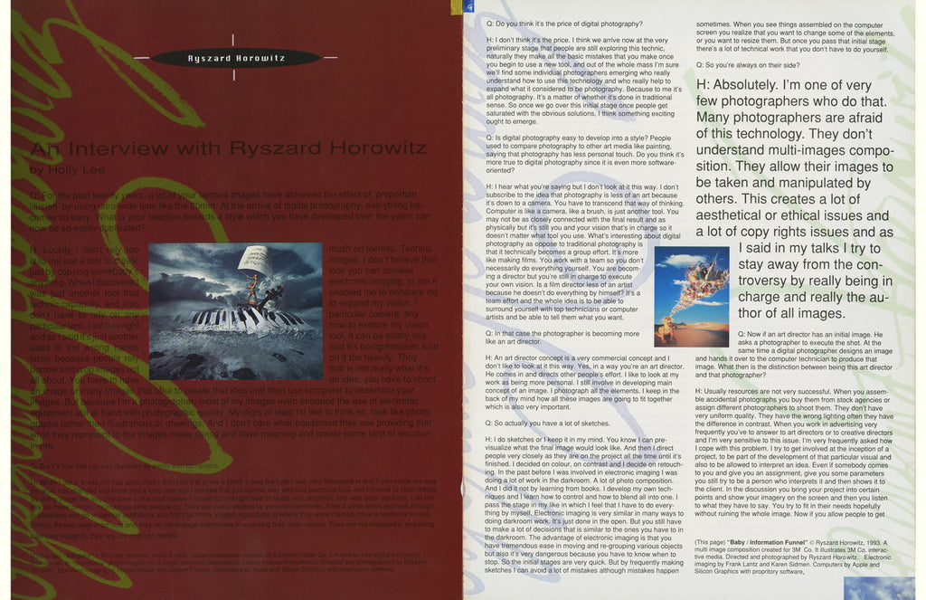
Sur•reality Issue, Artists: Chiu-Ping Ku 辜昭平, Tommy K. F. Li 李錦煇, an interview with Ryszard Horowitz by Holly Lee. Cover by David Lui.
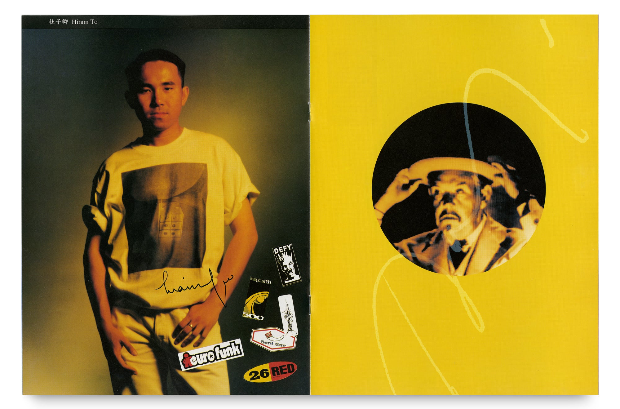
Both Chiu-Ping Ku and Tommy Li were illustrators, and members of the notable Illustration Workshop - the first influential graphic design studio from Hong Kongers in the 80s. Chiu-Ping Ku, notably one of the pioneers in digital imaging in Hong Kong, was technical-based and majored in 3-D rendering. Tommy K.F. Li (1954-2016) moved to Toronto in the early nineties and continued to work in paper sculpture as his illustration style. His fond of classical music had inspired him for the work in this issue.
Ryszard Horowitz is one of the professional photographers we admire. He’s a wizard juggling several balls and amazes you when those balls turned into birds and butterflies. In the early nineties he was one of the first photographers that could achieve images virtually impossible, walking the lines between analog and digital, he’d reached the point that what’s conceivable is attainable. We knew of his work since the early 70s, through magazines and publications, where he was widely publicized. Before electronic imaging his work was already surreal, bold and eye-popping. We had a chance to meet in 1993 when he was invited to an exhibition and a series of seminars entitled “Photographer in Computerland” held at the Hong Kong Convention Centre. We grasped the chance to meet him, and featured the interview in the second issue of DIGI.


DIGI, Vol. 1 #3 (April 25, 1994), 8.5x11 inch, 16 pages.
Symmetrical Aesthetics (對稱美學) Issue. Artists: Ho-Sang Wong 黄豪生 (Macau), Lau Ching-Ping 劉清平. Essay: Metabolism of Photographic truth in the digital age by Charles H. Traub. Cover by Ka-sing Lee.
In this issue, both Ho-Sang Wong and Lau Ching-Ping used Mac IIci and Photoshop to produce their work. We invited Charles H. Traub to write an essay for us. He was the Chairperson, M.F.A. Photo and Related Media, School of Visual Art, New York.


DIGI, Vol. 1 #4 1994, 8.5x11 inch, 16 pages.
Magic Hour Issue. Artists: Lewis Fishauf, Tandoori Yokoo, Pierre et Gals, Robert Roschenberg, Garbo & George, Yuki Tokoro, Rom Chan. (with apologies to Louis Fishauf, Tadanori Yokoo, Pierre et Gilles, Robert Rauschenberg, Gilbert & George, Yukinori Tokoro, Ron Chan). Essay by Blues Wong: In Search of Duchamp’s Power PC: The works of art in the age of digital simulation. Cover by Chiu-Ping Ku.
This issue was fun, but more importantly it was about appropriation, in which David Lui, Ka-Sing, Holly and Tommy Li, each chose one noted artist and appropriated their work (using slightly altered names). The interesting thing is, after Ka-Sing and I moved to Toronto, we actually met Louis Fishauf, the celebrated illustrator from the famous Reactor Studio, and whose work The Everyman Project we eventually featured in our gallery in 2011.


DIGI, Vol. 1 #5 1994, , 8.5x11 inch, 16 pages.
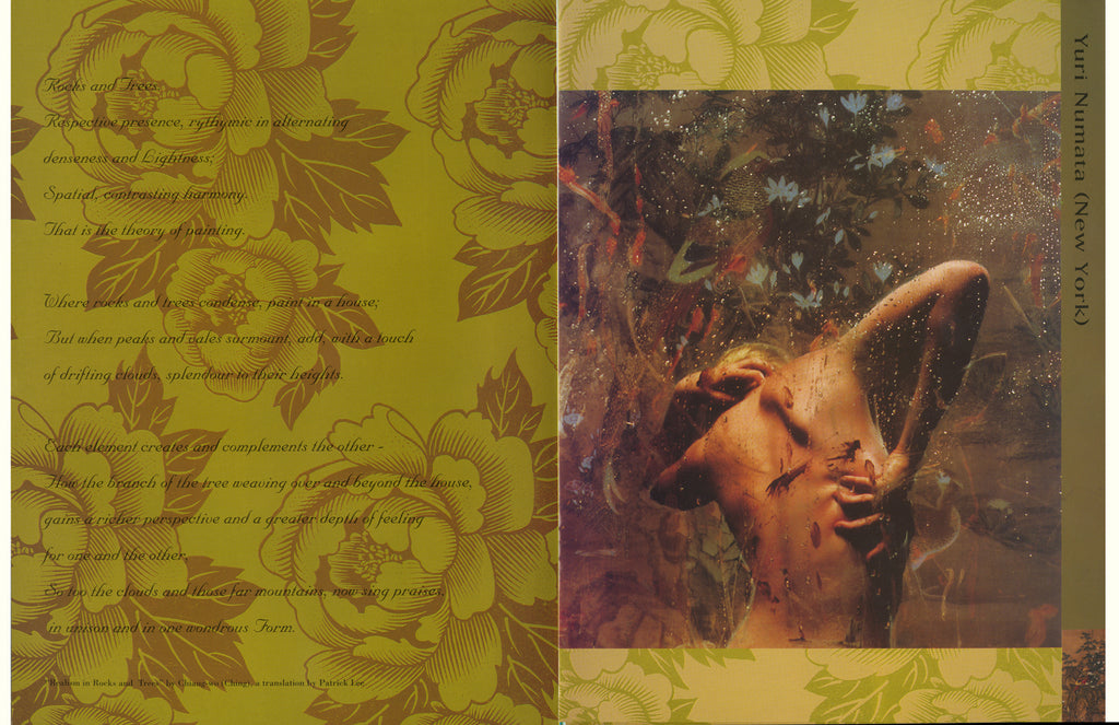
Flower Bird Insect Fish Issue. Artists: Yuri Numata, Wucius Wong 王無邪, Ka-Sing Lee, Alexander H. Shing, Goto Hiroshi, Yvonne Lo 盧婉雯, Eva Sutton, Ching-Ping Lau, Osamu Sato, Camay Wong. Cover by David Lui. Realism in Rocks and Trees, an excerpt from On Painting by Chiang-wo (Ching Dynasty, around 1820), translated by Patrick Lee.
A special issue featuring works grounded from traditional Chinese paintings. A number of overseas artists contributed to this issue. Each artist was supplied with an image of a traditional Chinese painting, based on this painting and worked on a new work. I was able to invite Wucius Wong, a Hong Kong painter (relocated to New Jersey by that time) who has been noted for his Chinese water-ink landscape from the 70s, to recreated a new digital landscape from an old Chinese painting. With the same painting as a reference point, The Tokyo-based Goto Hiroshi did something fresh and startling. From these works, the artist mind was revealed, the process and the way of applying new technology, the approach to establish a new work (also with very new tools) to reinterpret the old, all these different aspects were very intriguing.


DIGI, Vol. 1 #6 1994, 8.5x11 inch, 16 pages.
Neo-Drawing Issue. Artists: Hideaki Motoki, Ka-Sing Lee. Cover by David Lui.
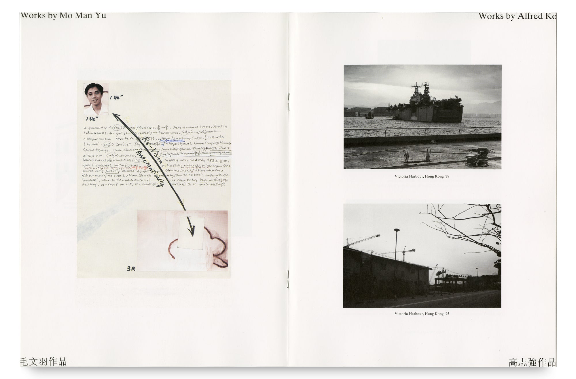
Two different forms of digital drawing. The work on “organic engines” (a word I invented) by Hideaki Motoki is simply fascinating. It is utterly artificial, yet revealing the artist’s and the computer’s mind are communicating, trying to speak the same language, and merging into one. Lee Ka-Sing employed another approach. He was using the lowest capacity of the computer, but the highest capacity of his brain. The hybridity of his work is still replete with human touch.


DIGI, Vol. 1 #7 1994, 8.5x11 inch, 16 pages.
Sphere Issue. Artists: Stewart Zief, Leo Chan, Robert Bowen, Kevin Suffern, Hiroshi Yoshii, Hideaki Motoki, Angela Perkins, Chiu-Ping Ku, Katsuhiko Hibino. Poem: Sphere. Several imperfectly metered phrases reminiscent of the strange algorithms governing life by Sonya Shannon. Cover by Hermann Rüegg.
A special issue dedicated to the sphere form. Nine artists of differing nationalities participated, exploring this theme by computation, to dig into the form its many visual possibilities. Sonya Shannon (USA), one of the forerunners of computer graphics, contributed a poem contemplating on this shape.


DIGI, Vol. 2 #1 1995, 8.5x11 inch, 16 pages.
Judgement Issue. Artist: Daniel Lee. Poem: I’m too busy by Patrick Lee. Cover by Ka-Sing Lee.
Daniel Lee was born in Chungking, China and grew up in Taiwan. He studied photography in the US and worked as an art director and later became a professional photographer in New York City. We met him around 1994 and were immediately entranced by his work, especially the series of portrait he’d just finished on the theme of reincarnation and judgement. We devoted a whole issue to feature his portraits, and in parallel we invited Patrick Lee, another Hong Kong photographer, to write a poem - a conversation with God, to go with this issue.


DIGI, Vol. 2 #2 1995, 8.5x11 inch, 16 pages.
101 Mona Lisa: CyberLouvre version.
A compilation of 101 digital works based on the image of Mona Lisa by international artists. Cover by Ka-Sing Lee.
She is the world’s most famous face. The most borrowed, used, copied, appropriated. Here we committed another offense, to use her face again. A hundred faces of Mona Lisa bloomed, morphed, glorified, mocked, transcended but mostly scrutinized. The effort in this issue showed a kaleidoscope of mind exercises.


DIGI, Vol. 2 #3 1995, 8.5x11 inch, 16 pages.
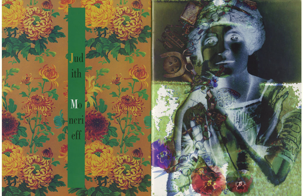
Unique EditionsX Issue. Artists: Dorothy Simpson Krause, Bonny Lhotka, Helen Golden, Karin Schminke, Judith Moncrieff. Cover by Holly Lee.
I met Dorothy Simpson Krause in Boston in the latter part of 1994, and learned that she and some other artists had formed Unique EditionsX - a group of artists who combined their expertise with computers and traditional art making techniques to produce editions of multiple originals from digital files. I was obviously interested and suggested to feature work from Unique EditionsX members in a future issue of DIGI. Dorothy was excited about the proposal and helped us to organize the work, which was put together in one issue with the group’s name.


DIGI, Vol. 2 #4 1995, 8.5x11 inch, 16 pages.
NeXtstop Issue. Artists: Chiu-Ping Ku, Ka-Sing, David Lui, Holly Lee. Cover by Ka-sing Lee collaborated with Iris Lee.
An issue featured selected work from the exhibition NeXtstop, a digital art exhibition by four artists held at Agfa Gallery, Goethe Institut, Hong Kong.


DIGI, Vol. 2 #5 1995, 8.5x11 inch, 16 pages.
Works by Steve Bliss & Alan Magee. Cover by Alan Magee.
In August 1995 I was in a three-day workshop conducted by Alan Magee taken place in CCI (the Center of Creative Imaging) in camden, Maine. Alan Magee was a noted painter in the realistic tradition, during that time he also ventured into digital imaging, mostly collages. He had finished a series of portraits related to artists, mostly writers, painters and I loved the surreal yet poetic quality of the work. Eventually I arranged to feature a selection of the portrait work along with the bodywork from Steve Bliss, an artist and professor of Photography at the Savannah College of Art and Design. The issue turned out to be an interesting juxtaposition.


DIGI, Vol. 2 #6 1996, 8.5x11 inch, 16 pages.
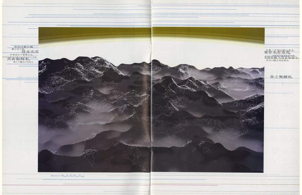
Shan Hai Jing Issue. Artists: Vasani Nayak, Hermann Rüegg, Pamela Hobbs, Sukit Punnachaiya, Wong Siu-Ka, Tadanori Yokoo, Holly Lee, Pito Collas. Cover by Ku Chiu-Ping. Design by Anothermountainman.
How do you decode a legend? Shan Hai Jing, literally translated as Compendium of Mountains and Seas, is ancient Chinese literature blending geography with mythology. One could take it word for word, and stun you with a human heart that is still beating, one could plainly grab some contents, and illustrated a landscape with inhabitants partly human partly beast; one could view it with obstruction, an uncertain place denial of entry, or one could approach it with a cosmic idea, it is everything and everywhere, while another could give you a slight slap in the face - here are the mountains and their algorithm. All is well, now we can start a conversation.


DIGI annual, Volume 1 and Volume 2
Cover jacket with image by Lee Ka-sing


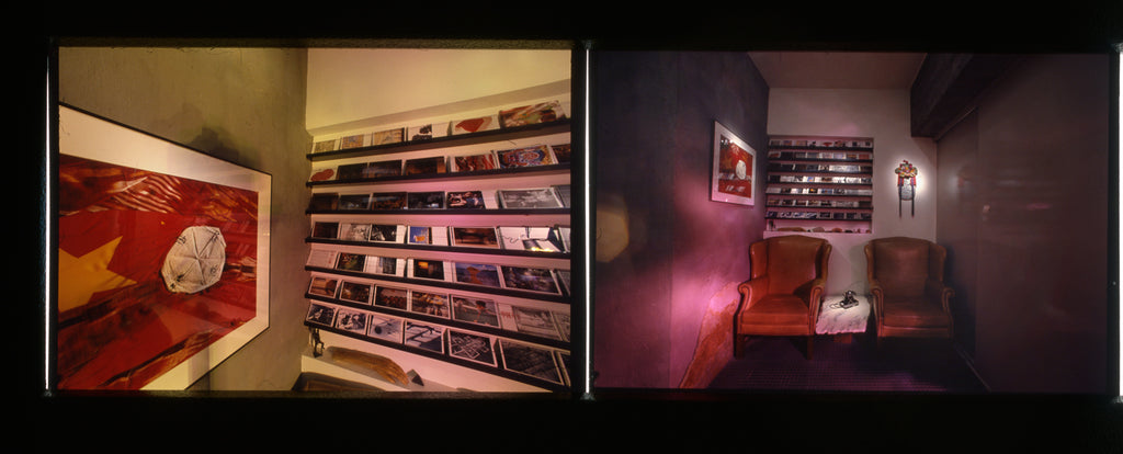
 The display of the Flip Book Project at the exhibition Both Sides Now (Gallery 50, Toronto, 2018).
 1
1